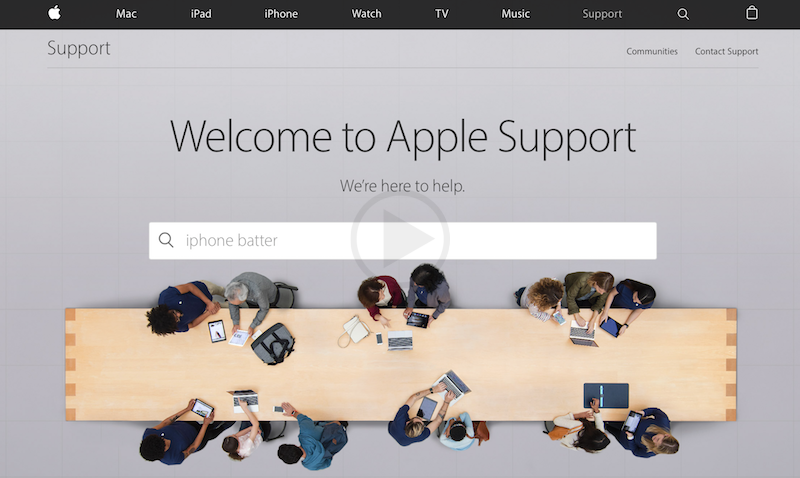
Apple is seen to be making a lot of changes in their devices and now finally they are also working towards upgrading their website too. Recently a lot of changes have been observed in the website of Apple. The new website is much easier to read as it has been broken down into several parts. The dedicated blocks are much easier to read and may easily capture the eyes and the mind of the people surfing information here. Talking about the first block, it has a dedicated search bar to serve the quick links for various types of information on the website.
The second block on the website is for the people who are there to find the support for their devices. It is broadly available for collecting information or downloading services like devices drivers for own Apple products. The third block on the website is for finding the most popular topics on the website for example: How to improve the battery life of the device? The next two blocks are for seeking information directly from the people or the Apple community. The final two blocks are for promoting the Apple workshops and their retails stores.
The recent changes down by the company on their website look absolutely legit. They have broken down the website broadly on the basis of the queries being surfed on daily basis. The design is clean and shall help people to directly click and find the information for which they have landed on the website without surfing much or wasting too much of time anywhere. Apple has been working on the design from quite a long time now and finally they have launched and rephrased the complete website for its users. The revamp was much required for them. They are hopeful about controlling the bounce rate of the website and increasing the time on site by improved design.

