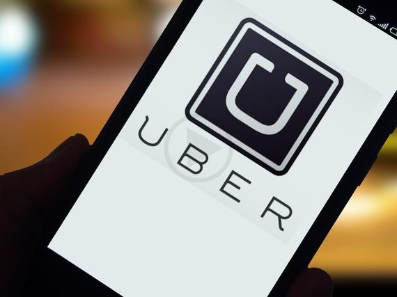
For changing the look and feel of the entire brand drastically, recently the transportation giant Uber made headlines. Among the discussions over the redesign strategy, the complete makeover of the popular logo was widely debated. Despite some love from fans, majority of the internet raised their eyebrows over the new look. The change of logo doesn’t mean that users stop using the service, rather people adjusting with the changes. Knowing this people might ask when brand recognition is important why change your app.
In certain cases, rebranding process is necessary to give a fresh look and feel of the company’s visual presence. Sometimes, apps are launched hurriedly without much focus on what catches the public eye. In order to analyse the power of the app and its effects, one need not read all the reports and opinions of Uber’s app logo change. Rather focus on ultimately securing more downloads in the long run.
Spotting the Difference
Tiniest of differences in design of the logo may sometimes lead to difference in downloads and revenues. One fine example of that can be Tiny Flashlight + LED and Color Flashlight Free which is almost similar apps released almost at the same time. The later has less than half of the first which has over 100 million downloads. This makes one think what could possibly be the reason for this difference, when the apps have similar functionality. There can be other factors such as app promotion ads, but it has been observed that a more colorful and vivid logo fetches more downloads. Therefore, it’s important to have brightness and clarity to create a sense that app is the best and the brightest option.
Colorful and Sophisticated
Although, there has been criticism initially, the Uber’s logo is likely to attract more attention than the old one and over time, the company would see significant changes in download volumes.

