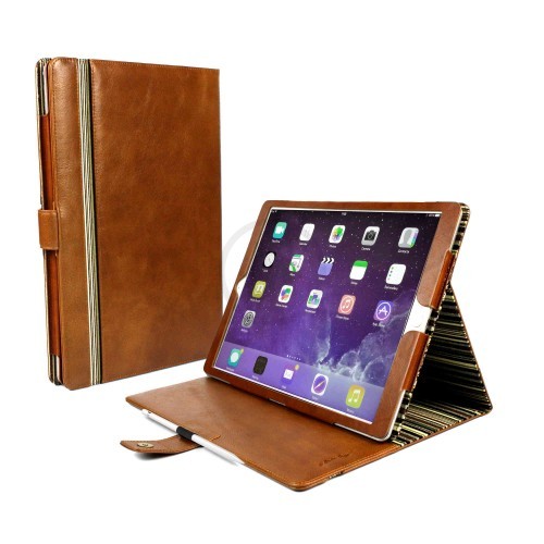
An iPhone is incomplete without a proper leather case, Apple never ignores this small but useful products. From silicon cases to leather ones, class was maintained everywhere. People often buy cases from outside vendors, but Apple’s touch is hard to copy. The hole for the camera was changed, everything else is pretty same. As for the leather one, one big change was seen. Some videos showed that this year’s cases have aluminum buttons, they are stunning. More space was given for volume and other buttons, the feel changed totally. Users will be pleased to use them; there is no scope for complaints.
Several colours are available, but Apple’s case looks dull. They didn’t do anything creative here, apart from the design changes. Tiny indentations were used previously, the buttons rested there. This made the experience uncomfortable; people were not pleased with the faulty design. The case slowly became fragile and pressing buttons became a nightmare.
Improvement is visible everywhere, Apple really made an effort to make customers happy. The microfiber will protect the handset from scratching; cases are mostly used for this purpose. The main buttons will not look odd; they are of the same colour. Machined aluminum was used to manufacture them, it gives the sturdy feeling. The edges are more prominent, it sticks out of the surface.
The camera’s angle will not be disturbed, users can click easily. The lightning port has got ample space too; charging can happen without any hindrance. The weight is not much, so no extra weight is added here. As always, Cook’s firm used superior quality leather to increase its value.
Typical leather has some really good characters, the case demonstrates that. The major issue is the price, Apple didn’t make it affordable. Well, iPhone users can go for it, but they will most definitely consider cheap options. Battery case is also good; it has one added benefit too.

